MEAN Stack Intro to Bootstrap Grids Day 2
The MEAN Challenge Continues!
This video is part of the 30 Day MEAN Stack Honolulu Challenge
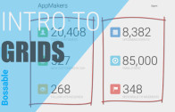
In this video we’ll go through an introduction to Bootstrap, and the Bootstrap grid in the first step to building a home page.
We look at:
– Our App Designs (use cases, storyboard, and wireframes)
– We’ll then take the design and split it into a Bootstrap grid layout.
– Locating the home page in the MEAN Stack app structure
– We start building a responsive web app using Bootstrap!
The functional design post mentioned in this video of the home page – use case, storyboard and wireframes can be found here: Home Page Design.
The code mentioned in this video is below:
This code goes into home.client.view.html
<section data-ng-controller="HomeController">
    <div class="row">
        <div class="col-sm-6">
            <div class="row">
                <div class="col-xs-2">
                    ICON
                </div>
                <div class="col-xs-10">
                    20,408
                </div>
            </div>
            <div class="row">
                <div class="col-xs-10 col-xs-offset-2">
                    TOTAL CUSTOMERS
                </div>
            </div>
        </div>

        <div class="col-sm-6">
            <div class="row">
                <div class="col-xs-2">
                    ICON
                </div>
                <div class="col-xs-10">
                    8,382
                </div>
            </div>
            <div class="row">
                <div class="col-xs-10 col-xs-offset-2">
                    UPCOMING EVENTS
                </div>
            </div>
        </div>

        <div class="col-sm-6">
            <div class="row">
                <div class="col-xs-2">
                    ICON
                </div>
                <div class="col-xs-10">
                    527
                </div>
            </div>
            <div class="row">
                <div class="col-xs-10 col-xs-offset-2">
                    NEW CUSTOMERS IN 24H
                </div>
            </div>
        </div>

        <div class="col-sm-6">
            <div class="row">
                <div class="col-xs-2">
                    ICON
                </div>
                <div class="col-xs-10">
                    85,000
                </div>
            </div>
            <div class="row">
                <div class="col-xs-10 col-xs-offset-2">
                    EMAILS SENT
                </div>
            </div>
        </div>

        <div class="col-sm-6">
            <div class="row">
                <div class="col-xs-2">
                    ICON
                </div>
                <div class="col-xs-10">
                    268
                </div>
            </div>
            <div class="row">
                <div class="col-xs-10 col-xs-offset-2">
                    FOLLOW UP REQUIRED
                </div>
            </div>
        </div>

        <div class="col-sm-6">
            <div class="row">
                <div class="col-xs-2">
                    ICON
                </div>
                <div class="col-xs-10">
                    348
                </div>
            </div>
            <div class="row">
                <div class="col-xs-10 col-xs-offset-2">
                    REFERRALS TO MODERATE
                </div>
            </div>
        </div>
    </div>

</section>
Video Transcript
0:00:00.909
Hi guys, and welcome back to the Mean Stack 30 Day Challenge! I’ve set myself a challenge to post a video everyday on how you can build your first Mean Stack App, and we’re going to jump straight into it.
What I’ve got open here is an interaction flow of the app that we’re going to build. I’ve got a home page, we’ve got a login page, and then we’ve got this customers section of the app.
In the customers section, we’ll have a page to view and search for customers and we’re also going to have modals. Modal windows that will pop up and we’re going to use that to create customers, and we’ll also have one to update customers.
So that’s the structure of the app that we’re going to build, and depending on how much time we have in the next 30 days, we might add a few more things to that as well.
To start off, we’re going to look at the home page. We’ve got a use-case here, for our fictitious company, and the idea is that the company is called App-Makers, and one of their employees, they need to be able to log into the app.
So in order to actually use it, they need to be registered, and they can register or login by using the Login button. The storyboard says that when the login button is selected then that will navigate the user to the login page.
So that’s the process for what we’re actually going to be creating.
0:01:30.650
So, what does it look like? We’ve already got a couple of wireframes, we’ve got one for the landing page for a mobile phone, we’ve got one for a landing page that displays on a tablet or desktop device.
I’m going to just pop that open, so what we’re looking at here is the landing page that we’re going to create for a mobile phone, when you’re looking at this, I want you to think of the content and think of what it would look like in a grid format.
We’ve got two columns, we’ve got one column for the icons, and we’ve got one column for the text. So, that’s when we’re looking at it vertically. And then when we’re looking at it horizontally, we see we’ve got these rows that are going across. So here we’ve got two rows, again we’ve got two rows, so on and so forth, through.
When we jump across to the tablet, so this is how we want the tablet or the desktop display to look. This time, we’ve got two key columns,
we’ve got these columns over here, and we’ve got a second lot of columns over here. And they take up about half of the screen, now within this particular column, again we’re split into another set – one column for the icons, and one column for the text. Again over here for this larger column we’ve got one column for the icons, and another column for the text, and we’ve got two rows for each of these sets of data.
And the reason why I’m talking in terms of this grid columns and rows is because we’re using bootstrap. If I jump across to bootstrap.
0:03:16.330
At getbootstrap.com, and you go across to the CSS section of getbootstrap.com, and just go down to grid system. You’ll see there’s
some example grids that they’ve got in their website here.
The way that bootstrap works is each row can be split into up to 12 columns, and each column can have a length. If you think about it, here we’ve got 12 columns, and they’re worth 1 column length, because you can only have 12 columns, so that’s the maximum they can have.
This next one down, we’ve got two key columns, this one has a length of 8, and this one has a length of 4, again they make up 12.
This time, we’ve got three columns, they’re all the equivalent of four columns each. If you measure them across the single columns, you’ll see they come up to four.
Again, 4 x 3 = 12. In the last one, you’ll see that this is equally split into two, so 12 divided by 2 = 6.
When we’re looking at the tablet, or that desktop layout, we said we needed to split it into two. We’ll be using a lot of these six sized columns. So, where are we going to do this? We’ll we’re going to create this landing page using our apps home page.
So, lets go and find that. I’m just going to make this smaller, so you can still see it.
0:05:00.150
I’m going to go to where this landing page is. So, the way that you find that, is whenyou go to the mean app, go to Public, and then go to Modules, and go to Core.
Core is where you find anything to do with the header part of the app, so the bit that you see at the very top of the app, and you’ll see the home page. Any of those related items, they’re in the core, as they make up the core of the app. So, we go down to views, and then we just go to home.
Now you see that because I’m using Webstorm, there’s a few things in here which are highlighted in this brown colour.
0:05:45.639
The reason for that is because I’ve just initiated Git, you can do that in two ways. You can either go to your command line, into your terminal and type git init, which initiates Git, for your source control. Or if you’re using Webstorm, you can go to VCS, Import into Source Control > Create, and that will set it up for you.
That’s an important thing to do before we start.
0:06:16.790
Before we actually start to do any editing, I’m just going to start up the App. So, just type in ‘Grunt’, and just let Grunt start up the Node server for us, and run it’s tasks, and start the app.
As soon as that’s done, when it say’s ‘Mean.JS application started on port 3000’. I’m just going to jump across and open up localhost:3000, and you can see, that here’s the mean app, that we have, that comes with the Mean.JS Stack.
I’m just going to remove everything between the Section Tags. So that can go. We’re going to start over here.
So I’m going to start by creating a row. This is going to be my overarching row. I’ll give that a bit of space.
Now I’m going to create my first column. I’m going to make that small. So, what I’m focusing on first, is this little section of the app here I’m really going to be looking at creating something that goes half the length of this row. The thing that I’m going to create is actually going to be a column that’s length of 6, and it’s split into two rows. One row for this top section, and another row for the bottom section.This top row is actually going to be further split into two columns.
We’re going with extra small because we want to maintain this structure when we’re looking at it on a mobile
0:10:18.816
Just to show you what we’ve got here. We’ve got our row which is just the whole page that we’re creating. Then we’ve got this particular div, and we’re making this go to half of this page, half way through. We’ve got two rows, because we’ve actually split this into two parts
The first row, we’ve got two parts to that again, we’ve split that into another column ICON and 20, 408. The second row, we’ve got ‘Total Customers’
So what we can do now is just copy that, and for each item, we will just make the change. So lets have a look at our handy work.
0:11:51.880,
I’ll just save that one over here. When you’ve got the screen reduced to that smaller width, Bootstrap media queries will kick in. It will actually change the layout of your page depending on what size screen that we’re looking at. When we’re looking over at our app. We see that we’ve got two key columns, and this is the equivalent of the appearance on a mobile device
You can see that bootstrap also includes this navigation bar at the top. And it’s got this little hamburger menu. When we make this bigger, we should actually see the hamburger menu has disappeared. And our structure has actually split into two.
So we’re starting to resemble what we’re looking for when we’re looking at the wireframe over here.
Alright, so that’s it for today, we’re going to pick it up again from here tomorrow, and we’ll get one step closer to turning our Mean Stack into a nice workable app
Thanks for joining me, please subscribe to the YouTube channel or check out www.bossable.com for more details.
Thanks again!


Hey Boss,
The app seems to have a default width set to 1140px . How did you change this?
Hey MH – Is your whole app stretched out?
1. Just check that your app/views/layout.server.view.html has the following:
<body class="ng-cloak">
	<header data-ng-include="'/modules/core/views/header.client.view.html'" class="navbar navbar-fixed-top navbar-inverse"></header>
	<section class="content">
		<section class="container">
			{% block content %}{% endblock %}
		</section>
	</section>
The main bit is this one:
Which uses the bootstrap container class.
2. If you have this already, then it may be that your bootstrap css isn’t loading correctly, or you may have some overriding css styles.
Hello Shristi,
This is Harsh again.
I follow the same process what you have mentioned in video 1,2 and 3.
Now when i write a HTML code in home.client.view.html file and then try to run in localhost:3000 then
nothing appear on my browser.
I run also grunt command in terminal and it says your mean app run on port 3000.
Can you tell me how to solve this problem?
Thanks in advance.
Hi Harsh – What kind of errors are you seeing in your browsers console?
Hello Shristi,
Here are my questions,
1) Can you explain why we need this command “git init”?
when i apply this command in my webstorm console then i get this error,
‘git’ is not recognized as an internal or external command,
operable program or batch file.
and after that i tried from VCS menu to creat git repositary, then it works. but why we need this?
2) and from this link localhost:3000, i get blank page and in console this error,!!!
Uncaught ReferenceError: angular is not defined
2config.js:12 Uncaught ReferenceError: angular is not defined
core.client.routes.js:4 Uncaught ReferenceError: angular is not defined
header.client.controller.js:3 Uncaught ReferenceError: angular is not defined
home.client.controller.js:4 Uncaught ReferenceError: angular is not defined
menus.client.service.js:4 Uncaught ReferenceError: angular is not defined
users.client.config.js:4 Uncaught ReferenceError: angular is not defined
users.client.routes.js:4 Uncaught ReferenceError: angular is not defined
authentication.client.controller.js:3 Uncaught ReferenceError: angular is not defined
password.client.controller.js:3 Uncaught ReferenceError: angular is not defined
settings.client.controller.js:3 Uncaught ReferenceError: angular is not defined
authentication.client.service.js:4 Uncaught ReferenceError: angular is not defined
users.client.service.js:4 Uncaught ReferenceError: angular is not defined
How do i solve this.?
Thank you.
Hi Harsh, thanks for your questions, my thoughts below:
1. git init is used to initialise your git repository (which is the same as what you’ve done using the VCS menu). It looks like you may not have git in your PATH. Git is used for Source Control. When you make changes to a file, you can isolate or roll-back breaking changes. You can also use git to backup your work to something like GitHub or BitBucket, and use it to package up your project so that it can be deployed to a cloud host. I’ve written an overview of git over here: https://bossable.com/75/do-you-git-it-open-source-tips-and-tricks/
2. The ‘Uncaught ReferenceError: angular’ error indicates that you may not have Angular installed, if you don’t have angular packages in your ‘Public > lib’ folder, then try this in your command line (without the $):
$ bower update
If you do have Angular installed, then you may be trying to load a script before you load Angular, in your Config > Env > all.js check that you’re loading Angular first, before the other scripts:
assets: { lib: { css: [ 'public/lib/bootstrap/dist/css/bootstrap.css', 'public/lib/bootstrap/dist/css/bootstrap-theme.css' ], js: [ 'public/lib/angular/angular.js',Awesome….:)
You were right, i didn’t set the path for Git in system variable.
I did it after i update bower and then i got lib folder in public directory (before lib folder was not there).
Now it works perfectly till Day 2.
Btw thank you so much. I am learning many things and enjoying your tutorial.
So, see you till my next question…;)
Have a nice week ahead…!!!