


AngularJS Material Design Toolbar Tips and Tricks
In this video we’ll have a quick look through the Angular Material Design starter app, and we’ll look at some tips and tricks for setting up Angular Material Design Toolbars, including: layout=”row”, layout=”column”, md-tall and tabs. Plus, we have a quick look at themes
If you’d like to create the same app that I’m using in the video, here is the list of prior videos in this series:
The series so far:
- Setup MEAN.js 0.4.0
- Add a MongoDB to your app
- Add Angular-Material to your app
- Create the AngularJS Material Starter App
Need an AngularJS Material Design Toolbar? Here are some examples to help get you started:
1. The Simple Toolbar
This example shows a toolbar with a simple h2 header.
<md-toolbar>
    <h2 class="md-toolbar-tools"> The Simple Toolbar </h2>
</md-toolbar>
- The class=”md-toolbar-tools” is used to apply a little formatting to the header text
2. The Simple Toolbar with 2 Elements
This example shows a simple toolbar with two elements.
<md-toolbar layout="row" layout-align="space-around center">
    <!--The left side-->
    <h3>The Heading</h3>
    <!--The right side-->
    <md-button aria-label="The Button"> Button </md-button>
</md-toolbar>
- The layout=”row” is used to setup the toolbar to align the ‘h3 heading’ on the left, and the ‘md-button’ on the right.
- The layout-align=”space-around center” is used to add some space around the elements within the row.
3. The Simple Toolbar with 3 Elements in 2 Span Groups
This example shows a toolbar with 3 elements – a header title, and two buttons.
<md-toolbar layout="row" layout-align="space-between center">
    <!--The left side-->
    <span> <h2 class="md-toolbar-tools"> The Heading </h2></span>
    <!--The right side-->
    <span>
        <md-button aria-label="First Button"> Button1 </md-button>
        <md-button aria-label="Second Button"> Button2 </md-button>
    </span>
</md-toolbar>
- The layout-align=”space-between center” is used to add some space between the elements within the row, this pushes the elements out to the sides.
4. The Hidden Hamburger
This example shows how we can get a hamburger menu to display on a small screen, and the full toolbar to display on a large screen.

<md-toolbar layout="row">
    <!--The left side is hidden when the screen size is larger than small -->
    <md-button class="menu" hide-gt-sm><i class="fa fa-bars"></i></md-button>
    <!--The right side-->
    <h1> The Hidden Hamburger </h1>
</md-toolbar>
- The hide-gt-sm attribute is used to hide the hamburger menu button when the screen size is larger than 600px wide
5. The Tall Toolbar
This example shows a tall toolbar with two elements at the bottom.
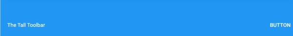
<md-toolbar layout="column" class="md-tall">
    <!--including a span with a flex here allows the h2 header to move down to the bottom of the toolbar-->
    <span flex></span>
    <!--Bottom-->
    <span layout="row" layout-padding>
        <!--Left-->
        <h2 class="md-toolbar-tools md-toolbar-tools-bottom"> The Tall Toolbar </h2>
        <!--Right-->
        <md-button aria-label="The Button"> Button </md-button>
    </span>
</md-toolbar>
- The class=”md-tall” is used to extend the toolbar size
- The layout=”column” is used to setup the toolbar to align one span at the top, and the other below
- The span flex is used to push the second span down to the bottom
6. The Tall Toolbar with Tabs
This example shows a tall toolbar with tabs at the bottom.

  <md-toolbar layout="row" layout-align="center end" class="md-tall">
    <div flex flex-sm="100" flex-gt-sm="95" flex-gt-md="80" layout="column">
        <h3>The Heading</h3>
        <span flex></span>
        <md-tabs md-selected="currentTab" md-stretch-tabs="always" class="md-primary md-hue-2">
            <md-tab id="tab1" aria-controls="Tab 1">
                <md-tab-label>Tab 1</md-tab-label>
            </md-tab>
            <md-tab id="tab2" aria-controls="Tab 2">
                <md-tab-label>Tab 2</md-tab-label>
            </md-tab>
        </md-tabs>
    </div>
</md-toolbar>
- layout-align=”center end” is used to align the contents of the row in the middle and at the bottom of the toolbar
- The div flex flex-sm=”100″ flex-gt-sm=”95″ flex-gt-md=”80″ is used to determine the amount of space that will be available for the tabs at small, greater than small, and greater than medium screen sizes
- The div with the flex’s, also has a layout=”column” to stack the heading, the span, and the tabs.
- The tabs are at the bottom of the column, the md-stretch-tabs=”always” stretches the tabs to take up all of the space available to it. If you don’t want the tabs to stretch, this attribute (md-stretch-tabs=”always”) can be removed