


AngularJS Material Design Autocomplete
In this tutorial video we’ll get fancy with Autocomplete!
We’ll look at some sweet little tricks that you can use when you’re working with small datasets. Both Local and Remote/Server side sets of data can be handled in a similar way once the data is available to AngularJS.
If you’d like to create the same app that I’m using in the video, here is the list of prior videos in this series:
The series so far:
- Setup MEAN.js 0.4.0
- Add a MongoDB to your app
- Add Angular-Material to your app
- Create the AngularJS Material Starter App
- AngularJS Material Design Toolbar Examples
- AngularJS Material Design Tabs, Forms & Toasts
- AngularJS Material Design Contact Form
If you’ve seen the AngularJS Material Design Autocomplete example you would have noticed that the demo has a lot going on.
But it doesn’t have to be so complicated!
Lets look at 4 steps to a simple and slick autocomplete experience:
- Add the Autocomplete directive to your view
- Hook the Autocomplete directive with your list of items
- Filter the Autocomplete input list to show matches as the user types
- Filter the list of user avatars as the user types
1. Add the Autocomplete directive to your view
To kick off, we can copy the Auto-complete directive example from the AngularJS Material Demo
The example code from the demo
<md-autocomplete
          ng-disabled="ctrl.isDisabled"
          md-no-cache="ctrl.noCache"
          md-selected-item="ctrl.selectedItem"
          md-search-text-change="ctrl.searchTextChange(ctrl.searchText)"
          md-search-text="ctrl.searchText"
          md-selected-item-change="ctrl.selectedItemChange(item)"
          md-items="item in ctrl.querySearch(ctrl.searchText)"
          md-item-text="item.display"
          md-min-length="0"
          placeholder="What is your favorite US state?">
        <md-item-template>
          <span md-highlight-text="ctrl.searchText" md-highlight-flags="^i">{{item.display}}</span>
        </md-item-template>
        <md-not-found>
          No matches found for "{{ctrl.searchText}}".
        </md-not-found>
</md-autocomplete>
Let’s remove everything except for the bare essentials.
The key bits that you’re likely to need
<md-autocomplete
          md-selected-item="ctrl.selectedItem"
          md-search-text="ctrl.searchText"
          md-items="item in ctrl.querySearch(ctrl.searchText)"
          md-item-text="item.display"
          md-min-length="0"
          placeholder="What is your favorite US state?">
        <md-item-template>
          <span md-highlight-text="ctrl.searchText" md-highlight-flags="^i">{{item.display}}</span>
        </md-item-template>
</md-autocomplete>
A quick look at the directives:
md-search-textThe text entered in the input boxmd-selected-itemThe item selected from the list available in the input boxmd-itemsThe list of items that should appear in the autocomplete input boxmd-item-textThe text that will be displayed in the list (to show the autocomplete list of options). You can choose to use an expression here, likemd-item-text="item.name + ' ' + item.id"md-min-lengthThe number of characters that the user should type before the autocomplete functionality startsmd-highlight-textWhen a user types into the autocomplete input, this matching text should be highlighted.
A quick clean up
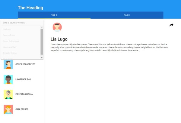
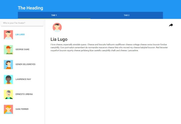
The next thing we need to do is update the ‘ctrl’ references to match the controller that we’ll use. In this example, I’m going to add the autocomplete feature to an existing demo app that has a list of user avatars in the sidebar.
The view: modules/core/client/views/home.client.view.html
The controller: HomeController as ul
<div flex layout="row" data-ng-controller="HomeController as ul">

    <!-- Container #3 -->
    <md-sidenav md-is-locked-open="$mdMedia('gt-sm')" md-component-id="left" class="md-whiteframe-z2">

        <md-content layout-padding layout="column">
            <form>
                <md-autocomplete
                        md-selected-item="ul.selectedItem"
                        md-search-text="ul.searchText"
                        md-items="item in ul.querySearch(ctrl.searchText)"
                        md-item-text="item.display"
                        md-min-length="0"
                        placeholder="Who is your Fav Avatar?">
                    <md-item-template>
                        <span md-highlight-text="ul.searchText" md-highlight-flags="^i">{{item.display}}</span>
                    </md-item-template>
                </md-autocomplete>
            </form>
        </md-content>

        <md-list>
            <md-item ng-repeat="it in ul.users">
                <md-button ng-click="ul.selectUser(it)" ng-class="{'selected' : it === ul.selected }">
                    <md-icon md-svg-icon="{{it.avatar}}" class="avatar"></md-icon>
                    {{it.name}}
                </md-button>
            </md-item>
        </md-list>
    </md-sidenav>

    <!-- Container #4 -->
    <md-content flex id="content">
        <!-- User details sample -->
        <md-icon md-svg-icon="{{ul.selected.avatar}}" class="avatar"></md-icon>
        <h2>{{ul.selected.name}}</h2>
        <p>{{ul.selected.content}}</p>

        <md-button class="share" md-no-ink ng-click="ul.share($event)" aria-label="Share">
            <md-icon md-svg-icon="share" ></md-icon>
        </md-button>
    </md-content>

</div>
The Home Controller and Data Service
You can find them here:
Angular Material Starter App
The Home Controller
The key element that we’ll be using of the home controller is this code here, which sets up and populates the users object.
        // Load all registered users

        usersService
            .loadAll()
            .then( function( users ) {
                self.users    = [].concat(users);
                self.selected = users[0];
            });

        var self = this;

        self.selected     = null;
        self.users        = [ ];
The Data Service
An example of the data returned from the Service (to help give you context of the structure) looks like this:
var users = [
{
name: 'Lia Lugo',
avatar: 'svg-1',
content: 'I love cheese, especially airedale queso. Cheese and biscuits halloumi cauliflower cheese cottage cheese swiss boursin fondue caerphilly. Cow port-salut camembert de normandie macaroni cheese feta who moved my cheese babybel boursin. Red leicester roquefort boursin squirty cheese jarlsberg blue castello caerphilly chalk and cheese. Lancashire.'
},
{
name: 'George Duke',
avatar: 'svg-2',
content: 'Zombie ipsum reversus ab viral inferno, nam rick grimes malum cerebro. De carne lumbering animata corpora quaeritis. Summus brains sit, morbo vel maleficia? De apocalypsi gorger omero undead survivor dictum mauris.'
}]
2. Hook the Autocomplete directive with your list of items
To access the list of users within the auto-complete input box, we can refer to the users object using ul.users. The md-item-text and md-item-template can also be updated to refer to the attributes of the object, in this case the ‘ul.users[i].name’ is referred to as ‘item.name’.
<md-autocomplete
                        md-selected-item="ul.selectedItem"
                        md-search-text="ul.searchText"
                        md-items="item in ul.users"
                        md-item-text="item.name"
                        md-min-length="0"
                        placeholder="Who is your Fav Avatar?">
                    <md-item-template>
                        <span md-highlight-text="ul.searchText" md-highlight-flags="^i">{{item.name}}</span>
                    </md-item-template>
                </md-autocomplete>
3. Filter the Autocomplete input list to show matches as the user types
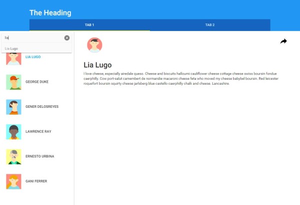
To easily filter the autocomplete list as the user types, we can just use a filter! In the same way as you would apply a filter to any other ng-repeat directive.
Please note: I’m not sure if md-items is intended to work this way, but it seems to work, so I’m going with it until I think of/find a better alternative
<md-autocomplete
                        md-selected-item="ul.selectedItem"
                        md-search-text="ul.searchText"
                        md-items="item in ul.users | filter:ul.searchText"
                        md-item-text="item.name"
                        md-min-length="0"
                        placeholder="Who is your Fav Avatar?">
                    <md-item-template>
                        <span md-highlight-text="ul.searchText" md-highlight-flags="^i">{{item.name}}</span>
                    </md-item-template>
                </md-autocomplete>
4. Filter the list of user avatars as the user types
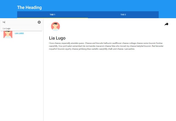
Whilst we’re at it, we can also easily apply the same filter to the list of user avatars in this example. Here is the final code for the view:
The view: modules/core/client/views/home.client.view.html
<div flex layout="row" data-ng-controller="HomeController as ul">

    <!-- Container #3 -->
    <md-sidenav md-is-locked-open="$mdMedia('gt-sm')" md-component-id="left" class="md-whiteframe-z2">

        <md-content layout-padding layout="column">
            <form>
                <md-autocomplete
                        md-selected-item="ul.selectedItem"
                        md-search-text="ul.searchText"
                        md-items="item in ul.users | filter:ul.searchText"
                        md-item-text="item.name"
                        md-min-length="0"
                        placeholder="Who is your Fav Avatar?">
                    <md-item-template>
                        <span md-highlight-text="ul.searchText" md-highlight-flags="^i">{{item.name}}</span>
                    </md-item-template>
                </md-autocomplete>
            </form>
        </md-content>

        <md-list>
            <md-item ng-repeat="it in ul.users | filter:ul.searchText">
                <md-button ng-click="ul.selectUser(it)" ng-class="{'selected' : it === ul.selected }">
                    <md-icon md-svg-icon="{{it.avatar}}" class="avatar"></md-icon>
                    {{it.name}}
                </md-button>
            </md-item>
        </md-list>
    </md-sidenav>

    <!-- Container #4 -->
    <md-content flex id="content">
        <!-- User details sample -->
        <md-icon md-svg-icon="{{ul.selected.avatar}}" class="avatar"></md-icon>
        <h2>{{ul.selected.name}}</h2>
        <p>{{ul.selected.content}}</p>

        <md-button class="share" md-no-ink ng-click="ul.share($event)" aria-label="Share">
            <md-icon md-svg-icon="share" ></md-icon>
        </md-button>
    </md-content>

</div>
Woohoo, how cool is autocomplete?!!
Until next time! 🙂
Thank you very much! 😀
I love this video. I too, was having trouble with the tutorial.
I’ve been trying to figure out how to make the content on the right window change when an avatar is selected, but haven’t figured it out yet. Could you please tell me which attribute to use? many thanks.
Awesome video. I was having a hard time with the Autocomplete in the Angular Material Demo. Your video was my saviour. Thumbs up!!
Shristi, Great examples and thanks for the tutorials. I’ve been learning a ton watching your videos.
I have a question about one behavior on the filter that works differently for me than it does in your video. When you added the filter to the line, the sidebar is empty on load and will only show the different avatars after clicking in the search box. I’ve done a lot of searching trying to figure out how to default the search to null on load but haven’t found a workaround yet.
Do you have any ideas why this is happening or how to fix it? Thanks!
Hi John – Just realised that my response to you seemed to have disappeared, so let me try this again:
Try and initialise the searchText in your controller, like: this.searchText = “”;