AngularJS Material Design Tabs, Forms & Toasts
If you’d like to create the same app that I’m using in the video, here is the list of prior videos in this series:
The series so far:
- Setup MEAN.js 0.4.0
- Add a MongoDB to your app
- Add Angular-Material to your app
- Create the AngularJS Material Starter App
- AngularJS Material Design Toolbar Examples
We’ll pick this video up from the end of the AngularJS Material Design Toolbar Tips and Tricks tutorial examples. In that post we looked at creating different types of toolbars (amongst other things) using AngularJS Material Design.
It looked something like this:
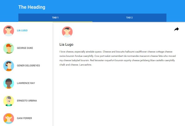
(accent has been changed to yellow here)
The AngularJS Material Design team have mentioned that Tabs have been heavily re-factored in the upcoming version. So we’re going to test it out, and have a play with a few other Material Design directives.
The code in this tutorial is based on 0.8.x and will be updated when 0.9 is released.
Here’s a short overview of both the video and this post:
| When we do this | It’ll look like this |
|---|---|
| When we select a Tab, the content area should change, using Angular ui-router |
 |
| When a page is refreshed, the relevant Tab for the view should be highlighted |
 |
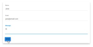
| In Tab 2, we’ll add a Material Design form |
|
| Lastly, we’ll display a Toast when the new form is submitted |

|
Let’s change the main content area when a Tab is selected
To get the Tabs to actually ‘work’, you could put the contents of the tab within the tab tags, like this:
<md-tabs>
      <md-tab label="one">
        <md-content>
          <p>This is the First Tab</p>
        </md-content>
      </md-tab>
      <md-tab label="two">
        <md-content>
          <p>This is the Second Tab</p>
        </md-content>
      </md-tab>
</md-tabs>
Look familiar? It’s an example lifted and simplified from the AngularJS Material Design site. It’s a good example, but it doesn’t help when your content for the tabs are in separate template files (as they really should be!).
There are other ways to use the AngularJS Material Design Tabs.
Instead of putting the contents within the md-tabs, we’ll use Angular ui-router to show a different template (html view), when a Tab is selected.
Why?
Because, the tabs are sitting in the header.client.view, but my content isn’t.
Here is the header.client.view:
The hamburger menu is hidden when the screen size is greater-than-small (small being mobile device size).

<div data-ng-controller="HeaderController" flex>
    <md-toolbar layout="row" layout-align="center end"
                class="md-tall"
                data-ng-controller="HomeController as ul">
        <div flex flex-sm="100" flex-gt-sm="95"
             flex-gt-md="80" layout="column">
            <span layout="row">
                <md-button class="menu" hide-gt-sm
                           ng-click="ul.toggleList()"
                           aria-label="Show User List">
                    <md-icon md-svg-icon="menu" ></md-icon>
                </md-button>
                <h2> The Heading </h2>
            </span>
            <span flex></span>
            <md-tabs md-stretch-tabs="always"
                     class="md-primary md-hue-2">
                <md-tab>
                    <md-tab-label> Tab 1</md-tab-label>
                </md-tab>
                <md-tab>
                    <md-tab-label> Tab 2</md-tab-label>
                </md-tab>
            </md-tabs>
        </div>
    </md-toolbar>
</div>
The First Tab
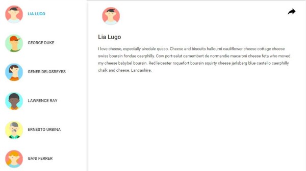
When the first Tab (Tab 1) is selected, I want the existing home page with the list of avatars to display.
Here is the home.client.view:
The sidebar is displayed when the screen size is greater-than-small (small being mobile device size).
<div flex layout="row" data-ng-controller="HomeController as ul">

    <!-- Container #3 -->
    <md-sidenav md-is-locked-open="$mdMedia('gt-sm')"
                md-component-id="left" class="md-whiteframe-z2">
        <md-list>
            <md-list-item ng-repeat="it in ul.users">
                <md-button ng-click="ul.selectUser(it)"
                           ng-class="{'selected' : it === ul.selected }">
                    <md-icon md-svg-icon="{{it.avatar}}"
                             class="avatar"></md-icon>
                    {{it.name}}
                </md-button>
            </md-list-item>
        </md-list>
    </md-sidenav>

    <!-- Container #4 -->
    <md-content flex id="content">
        <!-- User details sample -->
        <md-icon md-svg-icon="{{ul.selected.avatar}}"
                 class="avatar"></md-icon>
        <h2>{{ul.selected.name}}</h2>
        <p>{{ul.selected.content}}</p>

        <md-button class="share" md-no-ink ng-click="ul.share($event)"
                   aria-label="Share">
            <md-icon md-svg-icon="share" ></md-icon>
        </md-button>
    </md-content>

</div>
You can find the rest of the code, such as the controllers and the avatars here: AngularJS Material Starter App
The Second Tab
When the second Tab (Tab 2) is selected, I want a new page to display. Let’s call this the contact form.

Create a new view that will be ‘used’ by Tab 2
Here is the contact-form.client.view:
<div flex layout="row">
     <h1>The super duper awesome Contact Form will go here!</h1>
</div>
So, if you’re still with me, we have the following views:
- A Header, which contains UI portion of two Tabs (Tab 1 and Tab 2)
- A home page, which contains a list of avatars – this will display when Tab 1 is selected.
- A new view, which contains a Heading – this will display when Tab 2 is selected.
Using UI Router
Now that we’ve got a new view, lets add it to our AngularJS routes so that we can use it by referring to its state. State is a UI router concept – you can read about State here.
Add a new Angular Route for the new view (this goes in core.client.routes.js)
		// Home state routing
		$stateProvider.
			state('home', {
				url: '/',
				templateUrl: 'modules/core/views/home.client.view.html'
			}).
			state('contact', {
				url: '/contact',
				templateUrl: 'modules/core/views/contact-form.client.view.html'
			});
Tell your Tabs about your Routes
Now that we have our UI-router Routes, we can hook them up with our Tabs.
We’re using a ui-router directive here:
data-ui-sref This refers to the ‘state’ of the route that we want to use when the tab is selected.
Our current options are ‘home’ and ‘contact’.
Seeing the code might help:
            <md-tabs md-stretch-tabs="always" class="md-primary md-hue-2">
                <md-tab data-ui-sref="home">
                    <md-tab-label> Tab 1 </md-tab-label>
                </md-tab>
                <md-tab data-ui-sref="contact">
                    <md-tab-label> Tab 2 </md-tab-label>
                </md-tab>
            </md-tabs>
Note if you’re using rawGit: There is currently a known issue for ui-router and tabs in AngularJS Material Design 0.9 – Issue 2344
Okay. Now test it out.
Click Tab 1. Tab 2. Tab 2. Tab 1. Tab 2.
Go on. I’ll wait.
Umm… when I select Tab 2 and refresh the page, Tab 1 is highlighted
Yeah. That’s a shame.
Luckily we have a handy little directive that will clear that right up!
md-active This is a handy little material design directive that will show the Tab as ‘Active’ (i.e. selected), when it is set to True.
We’ll set md-active to true and make the Tab active based on the Ui-router state. Specifically $state.is which you can read about here.
Another look at that code:
            <md-tabs md-stretch-tabs="always"
                     class="md-primary md-hue-2">
                <md-tab data-ui-sref="home"
                        md-active="$state.is('home')">
                    <md-tab-label> Tab 1</md-tab-label>
                </md-tab>
                <md-tab data-ui-sref="contact"
                        md-active="$state.is('contact')">
                    <md-tab-label> Tab 2</md-tab-label>
                </md-tab>
            </md-tabs>
Now when you refresh the page, Angular Ui-Router will set the State, and based on a matching State, the active Tab will display with an accent highlight at the bottom of the Tab.
If you hit an error when you’re using $state on the view, just make sure you have included it in your controller (see the example of the header controller here)
Next, we’re going to turn our boring Tab 2 into a simple contact form. And when we Submit the form, we’ll display a little toast.
Create a Contact Form
Bring back the contact-form.client.view.
Now, we’re going to jazz it up with some material design directives.
We’ll center it. Put it in a whiteframe. And make it all pretty.
Center the content
Center the content by using a Row layout, with layout-align="center center". Rows help to set the size of a flex box horizontally.
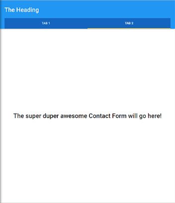
<div flex layout="row" layout-align="center center">
     <h1>The super duper awesome Contact Form will go here!</h1>
</div>
Add a basic form
If you’ve used AngularJS before, you’ll be familar with ng-submit and ng-model directives. Nothing crazy going on here:

<div flex layout="row" layout-align="center center">
    <form name="contactForm" data-ng-submit="sendMail()">
         Name: <input type="text" data-ng-model="contactName">
         Email: <input type="email" data-ng-model="contactEmail">
         Message: <textarea ng-model="contactMsg" columns="1" required></textarea>
         <button type="submit">Send</button>
    </form>
</div>
Let’s Jazz it up with Material Design directives!
Add a responsive whiteframe
This will ‘frame’ our form, and display at different sizes based on the size of the device on which it is being viewed:

<div flex layout="row" layout-align="center center">
    <div flex-sm="100" flex-gt-sm="90" flex-gt-md="70" flex-gt-lg="50" class="md-whiteframe-z2">
    <form name="contactForm" data-ng-submit="sendMail()">
          Name: <input type="text" data-ng-model="contactName">
          Email: <input type="email" data-ng-model="contactEmail">
          Message: <textarea ng-model="contactMsg" columns="1" required></textarea>
          <button type="submit">Send</button>
    </form>
    </div>
</div>
Add a content area for our form
This will give our form some nice padding around it to help it sit pretty.

<div flex layout="row" layout-align="center center">
    <div flex-sm="100" flex-gt-sm="90" flex-gt-md="70" flex-gt-lg="50" class="md-whiteframe-z2">
        <md-content class="md-padding">
            <div flex-sm="100" flex-gt-sm="80" layout-sm="column">
                <form name="contactForm" data-ng-submit="sendMail()">
                    Name: <input type="text" data-ng-model="contactName">
                    Email: <input type="email" data-ng-model="contactEmail">
                    Message: <textarea ng-model="contactMsg" columns="1" required></textarea>
                    <button type="submit">Send</button>
                </form>
            </div>
        </md-content>
    </div>
</div>
A splash of material design
Now, we’ll add in md-input-container, labeldirectives..
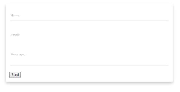
<div flex layout="row" layout-align="center center">
    <div flex-sm="100" flex-gt-sm="90" flex-gt-md="70" flex-gt-lg="50" class="md-whiteframe-z2">
        <md-content class="md-padding">
            <div flex-sm="100" flex-gt-sm="80" layout-sm="column">
                <form name="contactForm" data-ng-submit="sendMail()">
                    <md-input-container>
                        <label>Name:</label>
                        <input ng-model="contactName" required>
                    </md-input-container>
                    <md-input-container flex>
                        <label>Email:</label>
                        <input type="email" ng-model="contactEmail" required>
                    </md-input-container>

                    <md-input-container>
                        <label>Message:</label>
                        <textarea ng-model="contactMsg" columns="1" md-maxlength="150" required></textarea>
                    </md-input-container>

                    <button type="submit">Send</button>
                </form>
            </div>
        </md-content>
    </div>
</div>
And a sprinkle of the md-button directive for good luck. Don’t forget to admire your work.
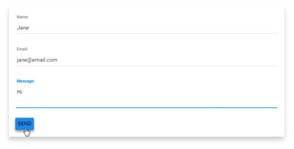
<div flex layout="row" layout-align="center center">
    <div flex-sm="100" flex-gt-sm="90" flex-gt-md="70" flex-gt-lg="50" class="md-whiteframe-z2">
        <md-content class="md-padding">
            <div flex-sm="100" flex-gt-sm="80" layout-sm="column">
                <form name="contactForm" data-ng-submit="sendMail()">
                    <md-input-container>
                        <label>Name:</label>
                        <input ng-model="contactName" required>
                    </md-input-container>
                    <md-input-container flex>
                        <label>Email:</label>
                        <input type="email" ng-model="contactEmail" required>
                    </md-input-container>

                    <md-input-container>
                        <label>Message:</label>
                        <textarea ng-model="contactMsg" columns="1" md-maxlength="150" required></textarea>
                    </md-input-container>

                    <md-button type="submit" class="md-primary"
                               ng-class="{'md-raised md-hue-1': (contactForm.$dirty && contactForm.$valid) }"
                               aria-label="Save Project">Send</md-button>
                </form>
            </div>
        </md-content>
    </div>
</div>
Let’s Toast!
When we click on the ‘Send’ button, let’s display a little toast to the user.
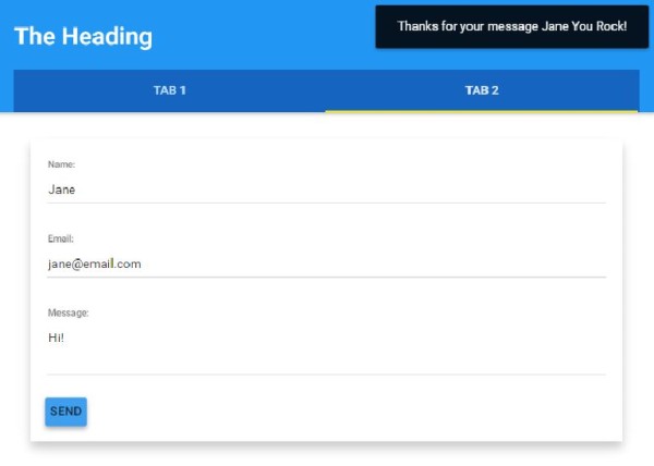
Add a Controller As reference to the top of the Form
<div data-ng-controller="ContactFormController as cf" flex layout="row" layout-align="center center">
    <div flex-sm="100" flex-gt-sm="90" flex-gt-md="70" flex-gt-lg="50" class="md-whiteframe-z2">
        <md-content class="md-padding">
            <div flex-sm="100" flex-gt-sm="80" layout-sm="column">
                <form name="contactForm" data-ng-submit="cf.sendMail()">
                    <md-input-container>
                        <label>Name:</label>
                        <input ng-model="cf.contactName" required>
                    </md-input-container>
                    <md-input-container flex>
                        <label>Email:</label>
                        <input type="email" ng-model="cf.contactEmail" required>
                    </md-input-container>

                    <md-input-container>
                        <label>Message:</label>
                        <textarea ng-model="cf.contactMsg" columns="1" md-maxlength="150" required></textarea>
                    </md-input-container>

                    <md-button type="submit" class="md-primary"
                               ng-class="{'md-raised md-hue-1': (contactForm.$dirty && contactForm.$valid) }"
                               aria-label="Save Project">Send</md-button>
                </form>
            </div>
        </md-content>
    </div>
</div>
Create a new Controller File
In this file: modules/core/client/controllers/contact-form.client.controller.js:
Add $mdToast and $animate as dependencies to the controller:
'use strict';

angular.module('core').controller('ContactFormController', ['$scope', '$mdToast', '$animate',
        function($scope, $mdToast, $animate) {
Toast!
When the Send button is clicked, we’ll display the toast:
angular.module('core').controller('ContactFormController', ['$scope', '$mdToast', '$animate',
        function($scope, $mdToast, $animate) {

            //3. we decide where the toast will display on the view
            $scope.toastPosition = {
                bottom: false,
                top: true,
                left: false,
                right: true
            };

            //2. the method looks for the position that we want to display the toast
            $scope.getToastPosition = function() {
                return Object.keys($scope.toastPosition)
                    .filter(function(pos) { return $scope.toastPosition[pos]; })
                    .join(' ');
            };

            //1. The send button will call this method
            this.sendMail = function() {
                $mdToast.show(
                    $mdToast.simple()
                        .content('Thanks for your Message ' + this.contactName + ' You Rock!')
                        .position($scope.getToastPosition())
                        .hideDelay(3000)
                );
            };
        }
    ]);
You could just as easily use this to display an error or success response message in a callback.
Woohoo, you just went through a whole bunch of AngularJS and Angular Material Design concepts, and rocked it out!
Until next time! 🙂
I thought I was going crazy… I had everything set right but the ContactFormController at the end wouldn’t load. It turns out that you need to restart the app before new controllers will be added for use. If you don’t the form looks like the error Shristi had when she hadn’t renamed the controller yet.
Great Tip John!
One little you forget that all your code makes sense. I can not find any ui-view=”xxx” defined. I do not understand how you tab content is displayed at all. On my side it does not work also 0.9.4 version of MD includes ui-sref attribute check in the source code.
Hey there – thanks for your question!
I’ve updated the post with the list of videos from the series so far. If you’d like to create the same app that I’m using in the video, here is the list of prior videos in this series:
The series so far:
Is there a GitHub page (or other) to see full code examples?
Hey Jim – not at the moment, some of the requested code examples are available in the Bossable store – still thinking about how best to manage code going forward.
Thank you so much for the tutorial! Is there any reason why “Tab 2” will only display the header again when selected? I can get the first tab to display the right html page, but tab 2 will only display the header a second time and not display the html linked to it. Thank you so much for any advice.
Hey Bill – Thanks for checking out the tute! Is your content for Tab 2 not displaying?
Do you get any errors in your browsers console when you select the Tab? I’d suspect that your routes may not be finding the right file.